Volvo updates brand identity, changes logo to a flat one like Kia, Toyota, VW
Volvo Cars has joined the list of car brands that presents a new and more stripped-down version of its brand logo. For the time being, we only encounter Volvo’s new logo in the brand’s advertising and communications.
The new logo has been made public without any big event to announce the launch.
It is now also live across Volvo’s social networks as well as on websites. However this change will take some time to reflect on the grille and steering wheel of its cars too quickly.
Several reports claim that Volvo is likely to use this logo on their cars for new models that appear in 2023 or beyond. However, Volvo has not come out with any official statement yet on the change in its corporate logo yet.
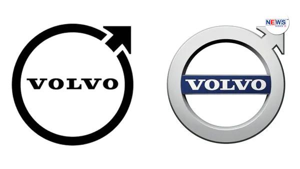
Volvo’s logo change comes after brands such as Renault, Kia, BMW, Toyota, Nissan and Opel also shared stripped-down versions of their logos. The new logo is a more simplistic version of the earlier one which had chrome 3D effect. The new corporate logo has the iconic ‘Iron Mark’ (or Swedish iron) symbol with a simpler monochrome design and two-dimensional elements. It is also a symbol for Mars, the planet as well as the God of war who trafficked in iron weapons.
The new Volvo logo is completely black, but also deviates in shape from the previously used logo. Not only is the edge of the circle thinner, the new logo also has to do without a horizontal strip in which the brand name is written. The Volvo brand name, derived from ‘volvere’ which in Latin means something like ‘I roll’, is still written centrally in the logo.
The round-shaped logo has been Volvo’s corporate identity since 1930s when it was first launched. Over the last century, it has undergone several changes. The previous logo was introduced at the turn of the century.
News Credit: Auto Hindustantimes


